Choosing a Sofa Color for Your Apartment Living Room
The sofa takes up the largest area in a living room, so its color largely sets the mood of the whole space. This article walks step by step through checking your wallpaper and floor tones, using neutrals and accent colors, how sunlight changes color, choosing lighter shades for small spaces, and tying the look together with cushions and rugs.
By 홈 핏 가구 Editorial Team Published Reading time: about 11 min
Key Takeaways
-
Check the sunlight direction Rather than judging the sofa color under showroom lighting, place a sample by your own window and check it in both daylight and evening light before deciding.
-
One dominant color Limit accent colors to one per space and carry them through small accessories such as cushions and rugs to reduce visual clutter.
-
Consider practicality too Light-colored sofas make a space feel larger, but stains are harder to manage, so please weigh your lifestyle and the material together.
Check the Wallpaper and Floor Tones First
Before choosing a sofa color, the first thing to check is the basic tone of your wallpaper and flooring. Whether the wallpaper leans warm beige or cream, or cool gray or white, changes which sofa colors will suit it. Flooring matters too: a light natural wood or a deep brown creates very different contrast with the sofa. It helps to place sample swatches or real finish materials side by side and compare them. Identifying the overall color temperature of the space naturally narrows your options. Rather than deciding from a single color chip, it is also helpful to check the color both in daylight and in the evening.
If your wallpaper and floor already contain several colors, use the one covering the largest area as your reference, since the wall color acts as the backdrop for the room. The sofa is a large mass placed against that backdrop, so working from a shade slightly lighter or darker in the same family usually avoids mistakes. For example, warm wallpaper pairs softly with a cream or camel of the same warmth, while calm wallpaper looks more composed with gray tones. Once this reference is clear, choosing the remaining elements becomes much easier.
You should also consider the color of the lighting. The same sofa can look soft under warm bulbs and cool and crisp under daylight-toned lights. When natural light from the windows mixes with indoor lighting, colors can shift more than expected, so check the color under the lights you use most often. Once these checks are done, the three elements of wallpaper, flooring and lighting form one consistent flow. Placing your sofa color on top of that flow helps the whole living room feel stable and connected.
The Stability of a Neutral Sofa
A neutral sofa is the safest choice when you are unsure about color. White, light gray and charcoal are colors with a gentle presence that do not clash with wallpaper or flooring and calmly support the space. Because the sofa is a large piece that rarely changes, a neutral that does not follow trends will stay fresh for years. Cushions and rugs can also change the look freely, which widens your options. For these reasons, neutrals are a particularly good standard for anyone choosing a sofa for the first time.
Even among neutrals, differences in lightness and saturation greatly change the atmosphere. Light gray makes a space feel open and airy, while charcoal adds weight and depth. A near-white sofa gives a clean, fresh impression but stains can be easily visible, so the material and maintenance should be considered together. Even within neutrals, a slight warm or cool undertone changes how well it harmonizes with the wallpaper, so it is important to place samples in front of the actual wall to check. Remember that these subtle differences decide the overall sense of stability.
Adding a little texture variation to a neutral sofa can reduce monotony. Even within the same grey, a fabric with a woven pattern or a material with visible grain will shift in appearance as the light changes, so the piece never looks flat. Adding a cushion or two in a slightly different tone then creates a sense of rhythm in the room. Rather than introducing many colours, changing texture and tonal contrast alone is the best way to make the most of a neutral palette. The result is a calm yet refined living room that stays fresh for years.
- If your walls and floors have warm tones, start by considering cream or camel shades.
- In spaces with cool tones, light grey or a cool charcoal works well.
- For white or off-white upholstery, choose easy-to-clean materials to make maintenance simpler.
- Opting for a textured material keeps a neutral sofa from looking dull.
How to Use an Accent Colour Well
An accent colour is a great way to add personality to your living room. Rather than choosing a bold colour for the sofa itself, it is easier and less risky to introduce colour through easily replaceable accessories such as cushions, rugs and throws. This way, the sofa, which anchors the room, can stay in a stable colour, while you change the mood with colour as your day-to-day feelings shift. An accent colour looks most refined when used across a small part of the overall surface. Knowing how much colour to use is ultimately what determines the finished look.
When choosing an accent colour, it is natural to pick a shade one step darker or lighter within the same family as your walls or floor. Using a completely opposite complementary colour can scatter the eye and make the space look busy. It also helps to limit a room to two accent colours at most, which keeps the look orderly. Repeating the same colour across sofa cushions, a lampshade or a picture frame creates a sense of connection. Repetition is an important device that makes colour appear to be a deliberate choice.
When experimenting with an accent colour, it is wise to start with accessories and observe how you respond. Swapping cushions for a few days and checking whether the room feels comfortable is a low-risk way to find your direction. If you like the result, you can extend the colour to larger elements such as a rug or curtains. Conversely, if it feels like too much, you only need to change the accessories, so the commitment is small. Approaching it step by step lets you express your living room's personality without disturbing the overall balance.
Understanding How Colour Shifts with Sunlight
Depending on the direction sunlight enters and the time of day, the same sofa can look entirely different in colour. In a south-facing living room, the long afternoon sun brings out warm beige or sand tones with extra softness, whereas in a north-facing room the same colour can easily look cool and muted. For this reason, when choosing a sofa colour, it is best to place samples near your window and check them several times during the day and in the evening, rather than relying on how the colour looks under showroom lighting. Dark colours in particular can feel heavier in spaces with less light, so take care.
Positioning your sofa in relation to the windows makes it easier to predict how the colour will change. If direct sunlight falls on the backrest or seat, it is safer to choose a fabric that resists UV exposure and a dye that resists fading. Conversely, if the sofa sits against a wall that receives less light, a lighter colour can keep the room from feeling dark and help maintain balance. Please also keep in mind that even the same colour will take in light differently depending on the sheen and weave of the material.
You should also consider that a colour looks different in daylight than after the lights are switched on in the evening. Under yellowish incandescent or warm indirect lighting, a grey or blue-grey sofa appears calm, but under cool daylight-toned lighting it can take on a stronger blue cast. Deciding on the lighting plan for the whole living room first and then checking the sofa colour under it will give you a much more accurate picture of how it will look in everyday life.
Why Light Colours Work in Small Spaces
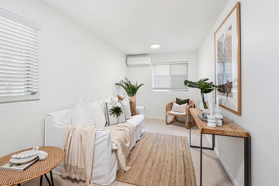
The most versatile approach, in any season, is to choose a sofa in a neutral tone. Colors such as grey, ivory, and dark brown carry little visual weight, so they blend easily even when the wallpaper or flooring changes. In Korean apartments, where the living room often serves several purposes, a neutral palette keeps the space feeling orderly without drawing attention away from everything else. When you want a change, a neutral base also makes it easy to refresh the mood with cushions or a rug.
A neutral sofa also helps create a sense of calm and stability in a room. Because the color itself is quiet, the texture of the walls, the plants by the window, and the warmth of wooden furniture come through naturally, giving the space a sense of breathing room. A neutral palette suits Scandinavian or minimalist interiors especially well. Be mindful, though, that if the neutrals differ too much in tone or feel overly cool, the room can look flat, so check the warmth of the surrounding finishes as well.
When choosing a neutral sofa, getting the lightness right matters. If the wall is fairly light, choose a sofa one or two steps darker to create contrast. If the floor is a dark wood tone, a slightly lighter sofa can help balance the weight of the room. Designing these differences in lightness on purpose lets even a neutral scheme feel layered rather than monotonous, resulting in a stable and inviting living room.
How to Coordinate Color with Cushions and Rugs
An accent color works most naturally when you carry it into other elements rather than the sofa itself. Instead of committing to a bold sofa, put color into easily replaceable pieces such as cushions, throws, or a small stool, and you can enliven the mood without much commitment. Picking a shade already present in the wallpaper or rug helps tie the accent into the room so it doesn't feel isolated. Keeping to one strong accent per room helps the eye settle.
If you want to use an accent color on the sofa itself, choosing a color with slightly reduced saturation tends to be the safer bet. Deep shades such as olive, terracotta, or deep blue add energy without overwhelming the room. Since the larger the piece, the greater the color's impact, it is more reliable to settle the colors of the walls and floor first and then borrow a single tone from among them. Repeating the same color in two or three places keeps it from looking accidental.
The most common mistake when using an accent color is introducing several colors at once. When the sofa, cushions, rug, and curtains each carry a different strong color, the space becomes scattered. A more refined result comes from choosing one dominant color and creating variation through its lighter and darker shades. Establishing clear criteria for selecting colors is the key to making an accent work.
It is widely known that using light colors in a small space makes it feel more spacious. Light tones reflect more light and soften boundaries, gently blurring the line between walls and furniture. Especially in small apartments with limited natural light, a dark sofa can make a room feel cramped and heavy, so lighter tones are often advantageous. Here, 'light' does not necessarily mean white; it includes warm light colors such as ivory or soft grey.
That said, a light color is not always the right answer. Light sofas show stains and dust more readily, and in a living room used frequently, the upkeep can become a real burden. It is therefore important to consider your lifestyle, whether you have pets, and whether children live in the home. Even when choosing a light color, you can keep it practical by selecting a stain-resistant material or a removable, washable cover.
When using light colors in a small living room, please also consider the height and shape of the furniture. A sofa with exposed legs lets the floor show through, making the space feel noticeably lighter, and combined with a light color the sense of openness increases further. By planning color and form together, you can create a living room that doesn't feel confining even in a limited area.
Cushions and rugs are the most flexible tools for balancing color in a living room without changing the sofa itself. If your sofa is neutral, you can soften the monotony by adding warm tones or fabrics with different textures to the cushions. Choose a cushion shade one or two steps deeper than the sofa, and the eye will settle naturally; repeat the same color across three or more pieces and the whole room will feel unified. Changing only the cushion covers with the seasons is also an easy way to refresh the mood of the room.
A rug defines the area beneath the sofa and ties the colors together. A rug lighter than the sofa creates a sense of lightness, while a darker one anchors the conversation area with weight. A rug close to the flooring tone makes the space feel continuous, whereas a contrasting tone marks off a specific zone. Choose a rug generous enough that the front legs of the sofa rest on it, and the furniture will read as one cohesive group.
When using cushions and a rug together, considering the mix of textures will make the colors look richer. Pair a textured knit cushion with a smooth leather sofa, or a cushion with a subtle sheen with a fabric sofa, and even the same color will appear to have more depth. Using color sparingly and textures generously is the basic principle for a living room that feels both cozy and orderly.
This article is for general information only and does not replace professional advice.